The rapid acceleration of digital transformation has repositioned visual language as a foundational framework for how humans interpret, retain, and act upon information in the 21st century. As organizations grapple with diminishing attention spans and the necessity for rapid upskilling, the strategic application of visual language—a system of communicating meaning through shapes, colors, symbols, and layouts—has transitioned from a secondary design concern to a primary cognitive and instructional necessity. In the context of modern enterprise training, visual language functions as the "grammar" of the digital age, enabling Learning and Development (L&D) and Human Resources (HR) professionals to bridge the gap between complex data and human comprehension.
The Scientific Foundation of Visual Processing
The shift toward visual-centric learning is driven by neurological imperatives. Research indicates that the human brain processes visual information approximately 60,000 times faster than text. This phenomenon, often referred to in psychological circles as the "Picture Superiority Effect," suggests that individuals are significantly more likely to remember information when it is presented as an image rather than a written word. According to studies on Dual Coding Theory, developed by Allan Paivio in the 1970s, the brain utilizes separate channels for visual and verbal information. When both channels are engaged simultaneously through a well-structured visual language, the cognitive load is reduced, and the capacity for long-term retention increases by as much as 65% compared to a 10% retention rate for oral information alone.
In the high-stakes environment of corporate training, these metrics translate directly into performance outcomes. Whether it is a technician learning to repair a complex piece of machinery via an augmented reality (AR) overlay or a new hire navigating a company’s culture through an interactive dashboard, the clarity of the visual language determines the speed of mastery.
A Chronology of Visual Communication Evolution
The development of visual language can be traced through a distinct chronology that mirrors the evolution of human technology:
- Pre-Industrial Symbolism: Early human communication relied on pictograms and ideograms, where a direct visual representation stood for an object or idea.
- The Rise of Typography (15th–19th Century): The printing press prioritized linear text, relegating visuals to "illustrations" that supported the written word rather than acting as a primary language.
- The Bauhaus and Modernism (Early 20th Century): Design movements began to codify the "grammar" of visuals, emphasizing that form follows function. This era introduced the systematic use of color and geometry to guide human behavior.
- The Digital Revolution (1980s–2000s): The advent of the Graphical User Interface (GUI) necessitated a standardized visual language—icons like the "trash can" or "floppy disk" became universal symbols of digital action.
- The AI and Multimodal Era (Present): Today, visual language is dynamic. It integrates motion, data visualization, and AI-generated imagery to create personalized, adaptive learning environments that respond to user interaction in real-time.
The Grammar of Design: Core Components
To function effectively, a visual language must adhere to a structured system of elements. In instructional design, these components serve as cognitive tools:
- Color Theory: Beyond aesthetics, color serves as a functional hierarchy. In enterprise training, red is globally recognized for warnings or critical errors, while blue often denotes instructional tips or "trust" environments. Strategic color usage directs the learner’s eye to the most pertinent information first.
- Typography: The choice of typeface dictates the "voice" of the instruction. Sans-serif fonts are preferred for digital clarity, while the weight and scale of text create a visual hierarchy that signals the importance of various concepts.
- Shape and Symbolism: Geometric shapes provide structure without words. Circles often imply community or completion (e.g., progress rings in an LMS), while rectangles and grids suggest stability and categorized data.
- Space and Composition: White space, or "negative space," is essential for managing cognitive load. By preventing visual clutter, designers allow the brain to process information in digestible segments, a technique known as "chunking."
- Motion and Interaction: In eLearning, motion is used to demonstrate processes that are difficult to explain in static text, such as the flow of electricity or the steps of a surgical procedure.
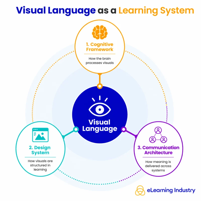
The Visual Language Model: Input, Processing, and Output
A robust visual language model operates as a three-stage cognitive pipeline. The first stage, Input, involves the sensory reception of visual stimuli—the learner sees an icon, a graph, or a layout. The second stage, Processing, is where the brain decodes these symbols based on prior knowledge and context. For instance, a learner sees a "gear" icon and immediately associates it with "Settings" or "Process." The final stage, Output, is the behavioral change or knowledge application that results from understanding the visual cue.

Industry experts argue that the effectiveness of this model is the primary differentiator between successful and unsuccessful digital transformation. "In an era of information overload, the organizations that win are those that can distill complex strategy into intuitive visual frameworks," notes a leading analyst in the instructional design sector. This model aligns closely with Sweller’s Cognitive Load Theory, which posits that instructional design should be used to reduce extraneous mental effort, allowing the learner to dedicate their full "bandwidth" to the actual subject matter.
Semiotics and the Risks of Global Scaling
As corporations expand globally, the study of semiotics—the science of signs and symbols—becomes critical. While some visual cues are near-universal (such as arrows for direction), many are deeply rooted in cultural context. For example, the color white symbolizes purity in many Western cultures but is associated with mourning in parts of East Asia. Similarly, hand gestures used as icons can be interpreted as offensive depending on the geographic region.
For Instructional Designers, this necessitates a "localization" strategy that goes beyond text translation. A visual language that works in a North American corporate headquarters may fail in a Southeast Asian manufacturing plant if the symbols and imagery do not align with the local cultural lexicon. Failure to account for these nuances can lead to what experts call "semiotic friction," where the visual message contradicts the intended instructional goal, leading to confusion or safety risks in the workplace.
Strategic Implementation in Corporate Environments
Leading organizations are now treating visual language as a scalable asset. By creating a standardized "Visual Design System" for training, companies ensure that every module, whether produced in London or Tokyo, feels part of a cohesive whole. This consistency serves several strategic purposes:
- Reduced Development Time: Using a library of standardized icons and templates allows L&D teams to deploy new training modules 30% faster than those starting from scratch.
- Enhanced Accessibility: A well-defined visual language supports neurodiverse learners and those with language barriers. By providing visual "anchors," designers ensure that the core message is accessible even if the learner’s reading comprehension is not the primary mode of intake.
- Data-Driven Decision Making: Dashboards that utilize high-level visual language allow executives to interpret training metrics at a glance, identifying skill gaps across thousands of employees in seconds.
The Role of Artificial Intelligence
The emergence of AI-powered learning systems is the latest frontier for visual language. Generative AI can now create bespoke diagrams and instructional visuals on the fly, tailored to the specific needs of an individual learner. For example, if a learner is struggling with a conceptual hurdle, an AI system can generate a personalized infographic that explains the concept through a visual metaphor the learner has previously shown a preference for. This level of hyper-personalization was previously impossible at scale, but it is now becoming a standard feature of advanced Learning Management Systems (LMS).
Conclusion and Broader Implications
Visual language is no longer a "nice-to-have" element of graphic design; it is the infrastructure of modern communication. As we move deeper into an era defined by data density and global interconnectivity, the ability to "speak" visually will define the effectiveness of educational systems and corporate training strategies alike.
The implications are clear: organizations that invest in a sophisticated, culturally aware, and scientifically grounded visual language will see higher engagement, faster time-to-competency, and better long-term knowledge retention. In the end, visual language does not just decorate information—it unlocks it, providing a universal bridge for human understanding in an increasingly complex world. Those who master this grammar will be the ones who lead the next wave of instructional innovation.